What you think your users want, and what they want, are not always the same
Earlier this year, we were lucky enough to work with a fantastic nonprofit organisation to carry out a research project to help understand what their users need from the website. The charity works within communities that benefitted least from economic and social development.
The website’s objective, set out to us by the charity, was to act as a network of organisations that provide parenting and family support for the people living in their target region.
This was a particularly exciting project for our Service Design team to carry out as it is what we love to do the most…getting to the heart of what users need.
What did we do?
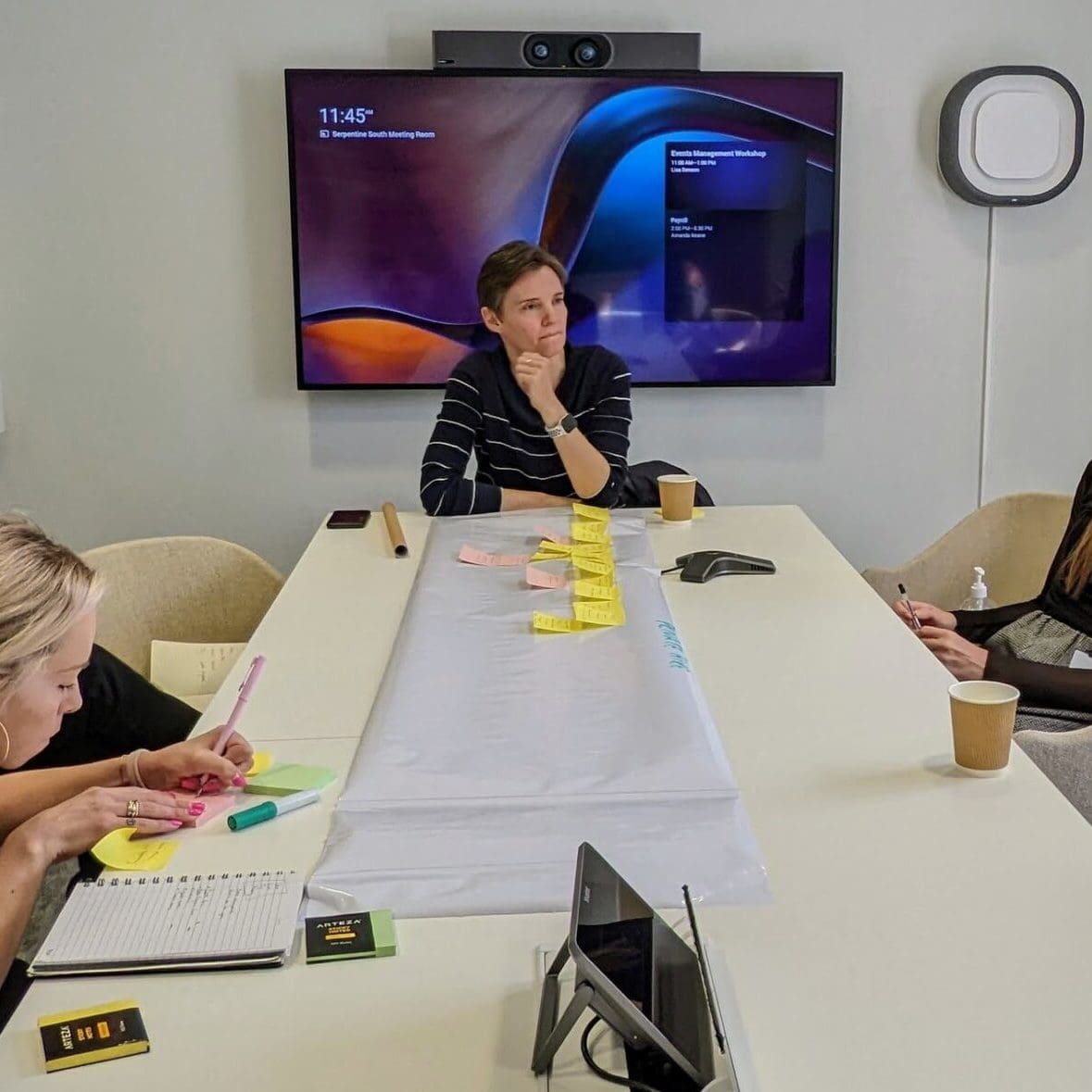
So that we could give the best recommendations to the customer on how they could make improvements to their website, we carried out two research phases involving those who are most likely to use the website.
Phase 1:
- A benchmark comparison of similar websites
- Analysis of current user behaviours and traffic data
- An online survey to explore users’ needs concerning parenting support and advice
- Usability testing sessions enabled us to see users interacting with the website in real-time
From this research phase, we were able to begin to explain and identify the key interests of parents and practitioners and what advice and resources they were most likely to search for online. The information that we gathered from phase one helped us structure phase 2 of the project and allowed us to dig deeper into the group’s interest groups, perceptions of the existing websites, and accessibility needs.
Phase 2:
- Three online focus groups with the website’s target groups.
What did we recommend?
Once our insights had been gathered, analysed and synthesized, we presented these back to the customer with some recommendations that will improve their ability to provide the support and advice that their target groups need:
- Prioritise page content — Web analytics showed us the specific areas of the website users were visiting more than others and recommended that a quick win would be to focus on improving the content and layout of these pages
- Define a clear purpose — Whilst the website intends to support both parents and practitioners, users were not always clear if they were accessing information directed at them – we recommended that the primary audience for the website should be parents, with this clearly illustrated on the homepage to reassure parents that they have reached a website that aims to give them support.
- Improve layout and functionality — Usability testing uncovered issues with navigation around the website and slow loading times. Some simple changes to the layout and reducing images sizes will enable users to find what they are looking for easily and quickly
- New & improved search function — Both parents and practitioners were likely to use the search bar of the website, but the current site did not show accurate results or take into consideration spelling errors. Improving this is another way to improve the user experience and reduce frustrations of not being able to find what they are looking for
- Streamline topics —The key issues that parents were most likely to search for support and advice. The website currently has a wide breadth of information directed at parents, but narrowing the focus to the issues that parents are most likely to value, will enable them to find and interpret this information with ease.
- Use of alternative formats to improve accessibility — Both parents and practitioners expressed that they would tend to look for information ‘on the go’ during their busy days. Formats like videos, audio, and images would enable them to absorb information without having to take the time to read lengthy articles, and would also improve accessibility for those who have learning disabilities or whose first language is not English
- Involve the end-user — Our final, and perhaps most important recommendation was to continue to involve their users in the design and improvement of the website. At Hyphen8 we believe that designing without users risks them feeling isolated, frustrated, and not able to receive the help they need
We were able to get great insight into the sometimes-uncertain experiences that parents go through and understand that what may seem like a small change to a website, can make a big difference to their day or even life. We look forward to seeing the improvements that are made to the website as a result of our research and hope that these small changes will make a big impact on the support that parents can access.


